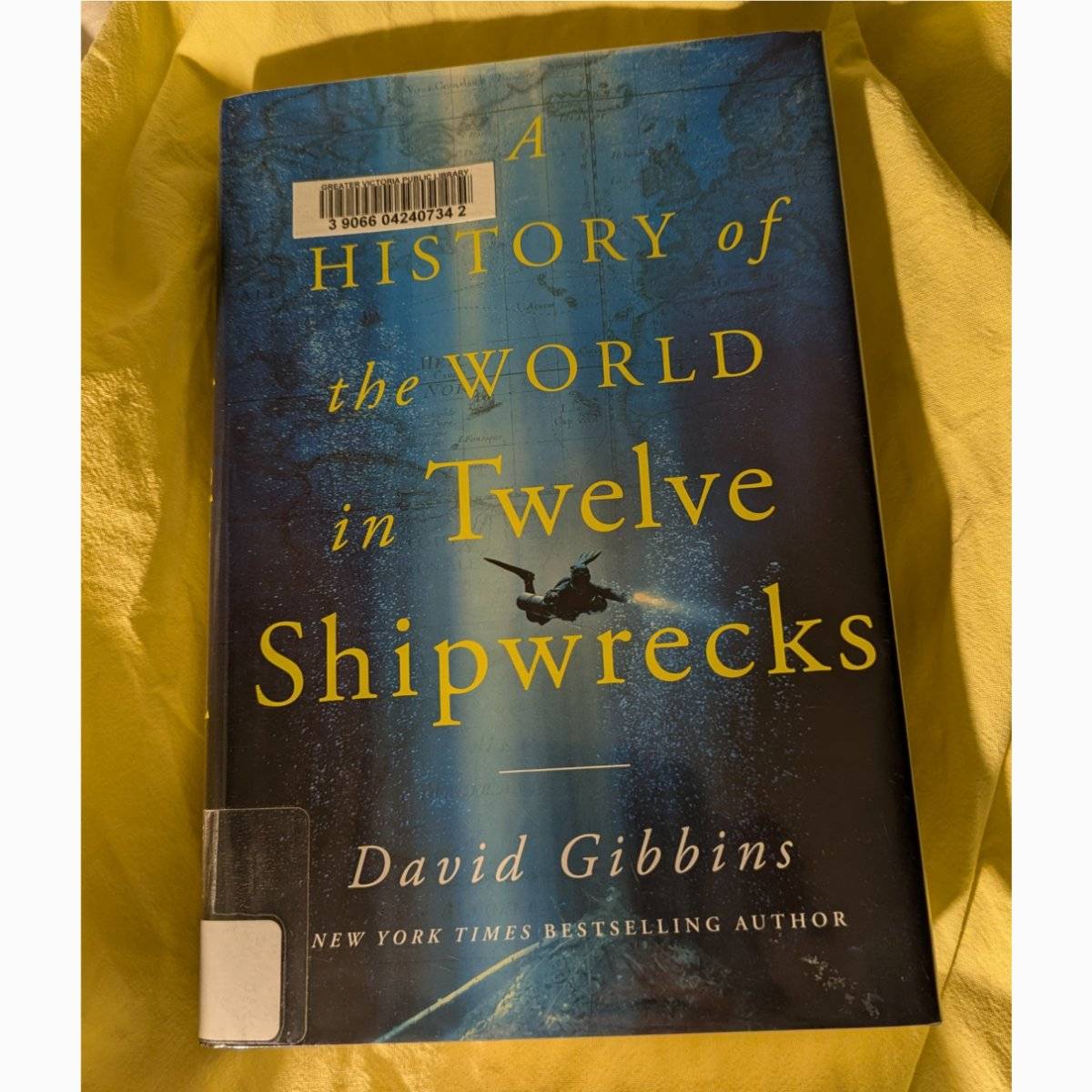


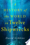


Cover grump entry # 2: Am I the only one who thinks the one on the left is WAY better?
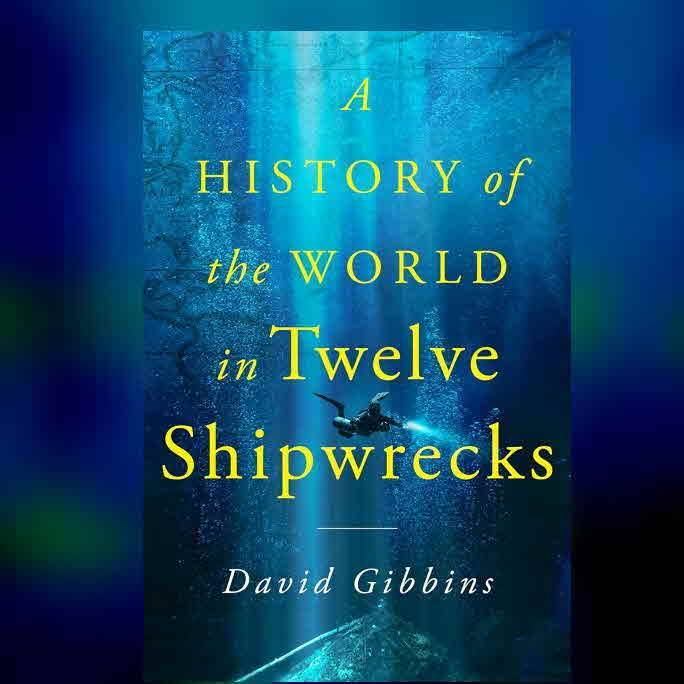
Yes, yellow text pops in a blue background, but something about the font says school project. I get what they were going with when they overlaid the underwater photo over a map of the world, but it kind of pulls focus from whatever underwater scene is being depicted? 1/2
Robotswithpersonality 2/2 The diver is clear, but not the wreck. Was there no worthwhile photo of an underwater wreck to focus on? Not a one? Technically the cover on the left doesn't depict diving or wreck archaeology, but it's so clearly a ship, and there's something about the lines (map lines, lines connecting history?) that works for me. 🤷🏼♂️ 7mo
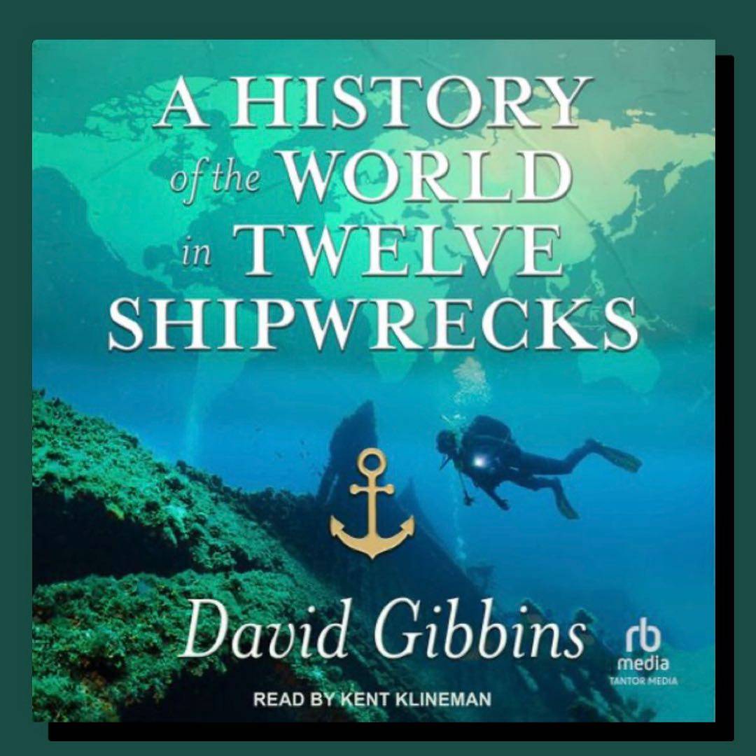
Larkken The one on the right looks a lot like the covers from a few of the “classic“ maritime archeology textbooks. Maybe that was what Gibbon was going for?. ( Esp reminds me of George Bass's, somehow) 7mo
Robotswithpersonality @Larkken Ah, context! Plausible. 🤔 7mo