


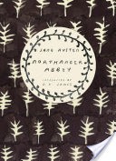

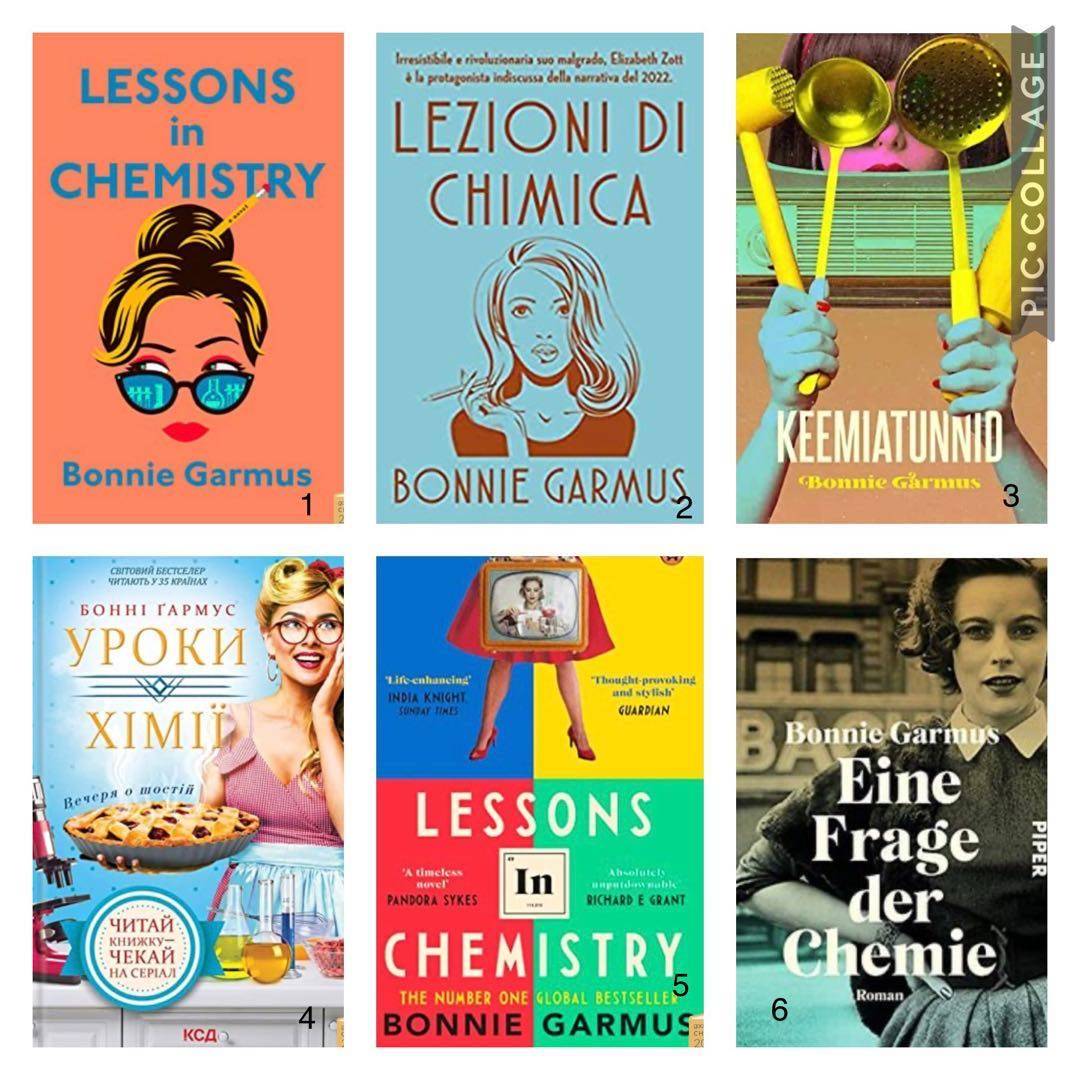
Okay Littens. Please select your favourite cover! Going strictly by cover appeal, I would pick up #6 first (the German edition) and #2 second (the Italian edition).
Cuilin #6 definitely 💯 2y
squirrelbrain I still prefer the UK one (5). Number 4 is awful! 😬 2y
Tamra #5 just edges out #3 for me. Fun comparison! 2y
See All 55 Comments
Lindy @Cuilin I like the woman‘s direct gaze, friendly rather than sad (so I can guess the tone) and that I know immediately it‘s historical fiction. 2y
IndoorDame I‘m right in line with your assessment on cover appeal 2y
Lindy @Tamra Both 5 and 3 emphasize the wackiness, which I found is part of the appeal of this novel. 2y
Lindy @squirrelbrain #4 could be soft porn 😬 In #4‘s favour, Elizabeth did turn her kitchen into a chemistry lab. And the tv execs wanted her to wear sexy clothing. But she refused. I doubt she would have worn the high heeled pumps in #5 either. 2y
Cuilin @Lindy I love the black and white photo. Eye contact for the personal touch. Sets the tone and time. Hand on hip. Nostalgia tinted with challenge. (edited) 2y
Lindy @IndoorDame Hey Adina! 👯 2y
Lindy @Cuilin Yes! The hand on hip. 👌 (edited) 2y
MissHel Oooh #4 or #3 are my favorites. It‘s the use of color for me. 2y
TrishB Same as you 6 & 2. 2y
julesG My favourite is #5. The German edition (#6) is great, too. The wackiest is #4. 2y
Lindy @MissHel The colours on #3 remind me of Andy Warhol‘s art. 2y
Lindy @TrishB 😊👯👍 2y
Lindy @julesG My initial reaction to #4 is that it doesn‘t represent Elizabeth‘s character at all, but its wackinesss is growing on me. Reminds me of an American tv show I watched when I was a kid: The Beverly Hillbillies. 2y
Karisa Wow! Such different depictions. Not sure any nailed it. I think #5 is my favorite because of the old fashioned 📺 and the nod to the periodic table. There‘s a lot going on and the colors are a bit much though? Tv test pattern-ish? 2y
jlhammar Same, the German edition is my favorite. 2y
Suet624 My only thought is #1 is the worst of the 6 choices. 2y
EKonrad #5 but I wish the color scheme was different 2y
BookNAround I like 6, then 3, then 5. 2y
Lindy @BookNAround The strangeness of #3 grows on me, the longer I study it. There‘s some mystery to it. 2y
Desha 5 then 2 then 6 for me 😆 2y
Lindy @EKonrad Ah! I hadn‘t thought much about the colour scheme. What colours would you prefer? 2y
Lindy @Karisa The tv and periodic table, I appreciate that. @EKonrad has also mentioned reservations about the colour scheme in #5 2y
Sparklemn Definitely #5 2y
Lindy @Desha Nobody is choosing #1. I‘m starting to feel sorry for whoever designed that cover. 2y
Lindy @jlhammar @Suet624 @Sparklemn Thanks for playing along 🤗 2y
EKonrad I don‘t even know what colors would be better. 🤷🏽♀️ But those seem too cheerful or upbeat for the overall tone of the book. 2y
Karkar 5 is my favorite 2y
LeahBergen Hmm… 6 is my favourite and then the slightly wacky 3. 😆 2y
Desha @Lindy I agree 😂 2y
Daisey 5 and 6 are my favorites. I really love the periodic table aspects in the British edition. 2y
marleed I have such envy of the British edition (#5)! 2y
CarolynM #6 is the most like I picture Elizabeth, but I think #5 is clever in the way it captures so many elements of the story (no pun intended😆) (edited) 2y
Billypar For me, it's #3 by a landslide. I love the strange layout and color combo. 2y
Lindy @marleed @daisey @desha @LeahBergen @Karkar @EKonrad @Sparklemn @BookNAround @Suet624 @jlhammar @Karisa @TrishB @MissHel @julesG @IndoorDame @Cuilin @squirrelbrain @Tamra Thanks everyone! #5 is the most popular (9 1/2 votes) but 6 is a close second (7 1/2 votes). I gave a half vote to each of two covers if someone said they liked two equally. 2y
Tamra What a fun poll! 2y
Lindy @Billypar I tallied votes too quickly! @MissHel is a fan of 3 too. 2y
Lindy @CarolynM Thanks for weighing in, Carolyn. I tallied votes too quickly. I shall assign a half vote from you to both 5 and 6, bringing the total to 10 votes for 5 and 8 votes for 6. 2y
CarolynM You didn‘t ask, but #4 is my least favourite, the expression on the face makes Elizabeth look like a total airhead. 2y
Lindy @CarolynM I‘ve now studied all of them so long that I can see redeeming qualities in all of them… but 4 is at the bottom of my list too. 2y
LeahBergen I love this poll! 👏 2y
batsy I love 3. It's so quirky and interesting. Then 2 🙂 2y
squirrelbrain Fascinating results! Thanks for doing this Lindy! ⚛️ 2y
TrishB Thanks Lindy 👍🏻 that was fun. 2y
julesG This was fun! And I agree with @CarolynM, #4 makes Elizabeth look like an airhead. A slightly stern face might have been better. 2y
Lindy @batsy Thanks for weighing in. There are now 2 1/2 votes for 3, which brings it into a distant third place in popularity. So far, nobody has chosen either 1 or 2 as first choice, but there is a 1/2 vote for #4. (I‘m not going to factor least favourites into my informal poll.) 🤓 2y
batsy @Lindy I'm enjoying the feedback on this informal poll 😆 4 is also my pick for least fave. 2y
webhau1 5 is my favorite 2y
Amiable I literally just started this book this morning. Without having read more than the first two pages, my eye goes to 5. And then 3. Cover 6 immediately makes me think of books by Mary McCarthy. (edited) 2y
Prairiegirl_reading Five and six are my favourites. While I think the pencil in her hair in #1 is a great touch I‘m sick of so many animated covers with romance and “chick lit”. 2y
Rissreadswithcats I like 2 and 6 too! 2y
Lindy @webhau1 @Amiable @Prairiegirl_reading @Rissreads Thanks for weighing in. I‘m continuing to tabulate results and plan to talk about this poll and the cover designs in my next booktube video. 🤓 2y
Prairiegirl_reading @Lindy 👏🏼👏🏼👏🏼I‘ll be watching! 2y
46 likes55 comments