Home Feed
Home
Search
Search
Add Review, Blurb, Quote
Add
Activity
Activity
Profile
Profile
#coverchoice
blurb
Sharpeipup
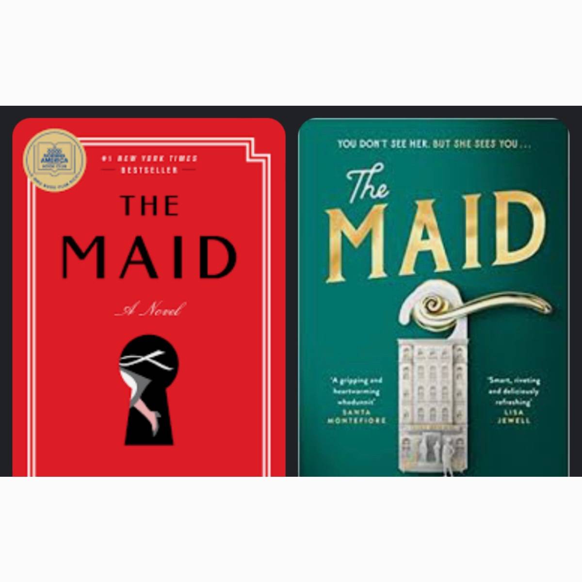
The Maid | Nita Prose
post image

While the left cover is popular, I find the right one clever!
#coverchoice
EvieBee Me too! Also I love me some green. 2y
5feet.of.fury @EvieBee agreeee if maybe only because I tried to “rainbow” my shelves and I have so many red! (And blue) 2y
31 likes1 stack add2 comments
blurb
Sharpeipup
post image

I‘m fascinated by different book covers. Which one gets your vote?

#coverchoice

Amie I like the one on the right 2y
Bookwormjillk Left just because it seems more topical 2y
28 likes1 stack add2 comments
blurb
Sharpeipup
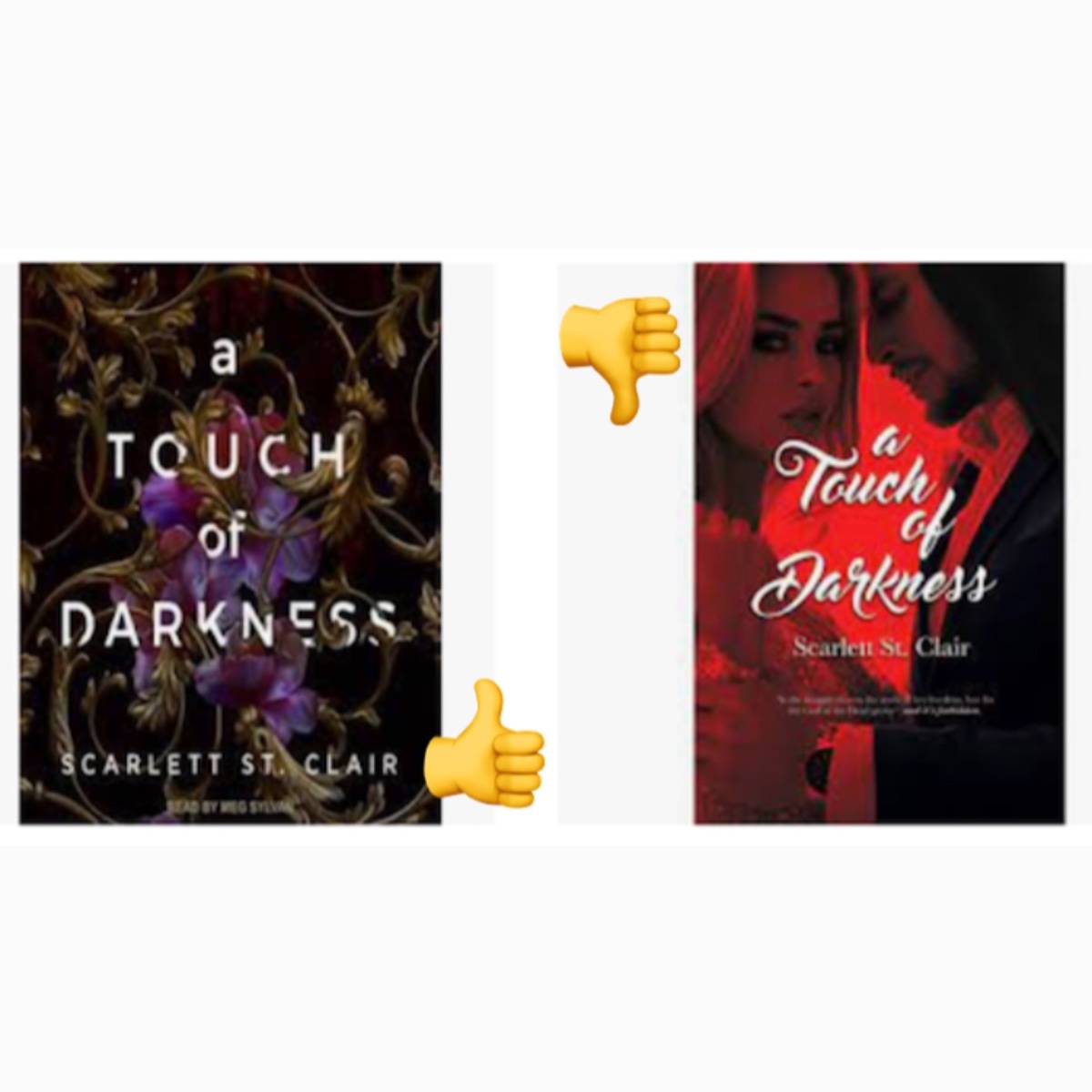
A Touch of Darkness | Scarlett St Clair
post image

Not sure I would have read this story if I had seen the cover on the right.

How about you?

#coverchoice
5feet.of.fury The left certainly sets the mood better 2y
Amiable Agreed! 2y
Kelly_the_Bookish_Sidekick The left is a prettier cover but the one on the right makes me think it's smutty. I like smutty. 2y
29 likes1 stack add3 comments
blurb
Sharpeipup
post image

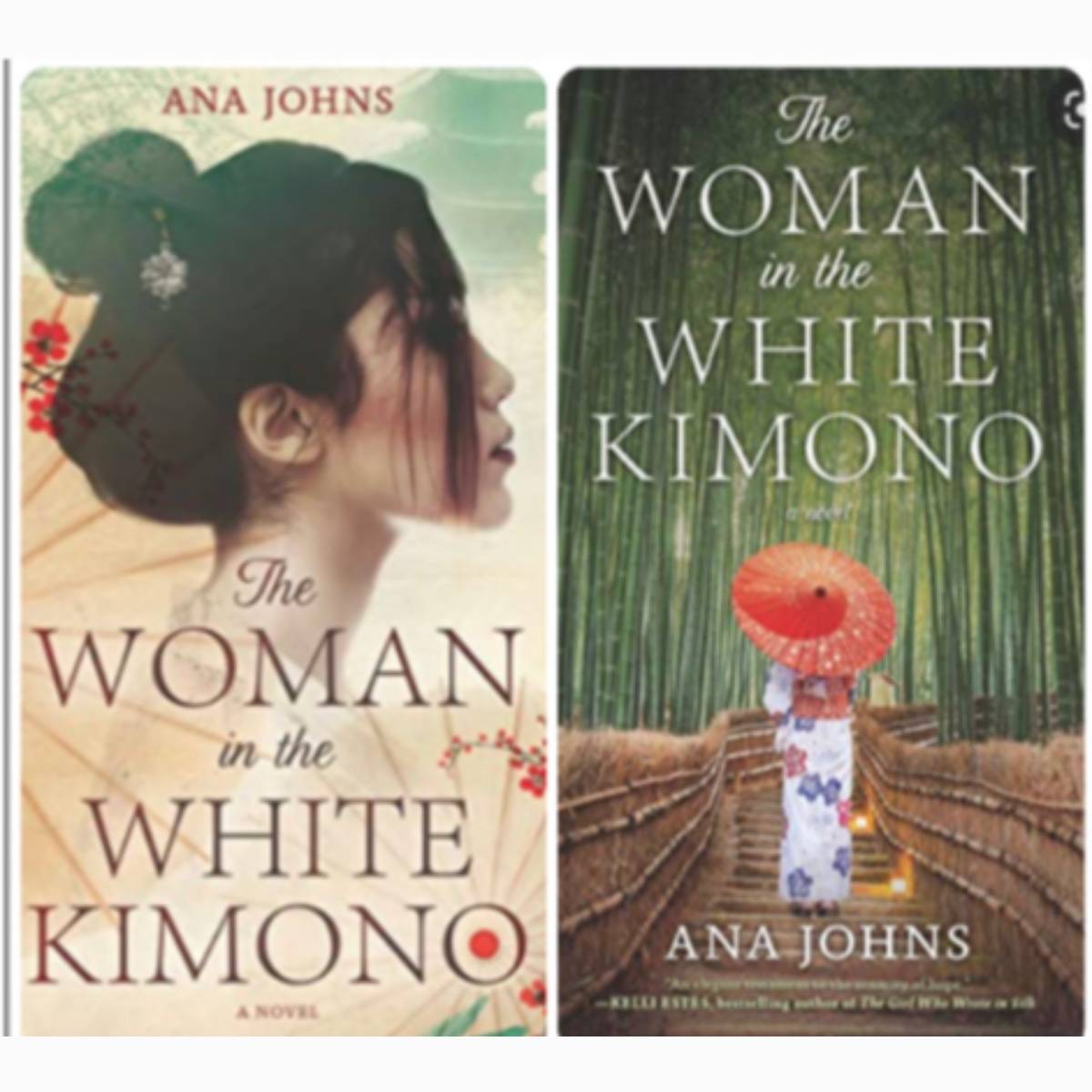
Which cover do you prefer?
#coverchoice

wanderinglynn I like the one on the right because it shows the white kimono and I like the background. 2y
Gissy Both cover are beautiful but I think the woman walking in that bridge, forward, could means so many things! 👘 ❤️ 2y
Susanita I prefer the one on the right with the complementary colors, though the more monochromatic cover is also pretty. 2y
29 likes1 stack add4 comments