This was a fun read!
6 likes

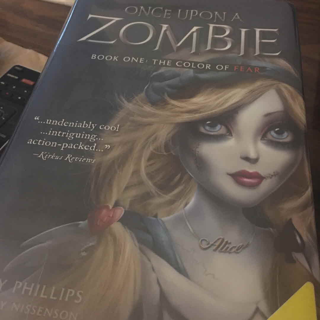
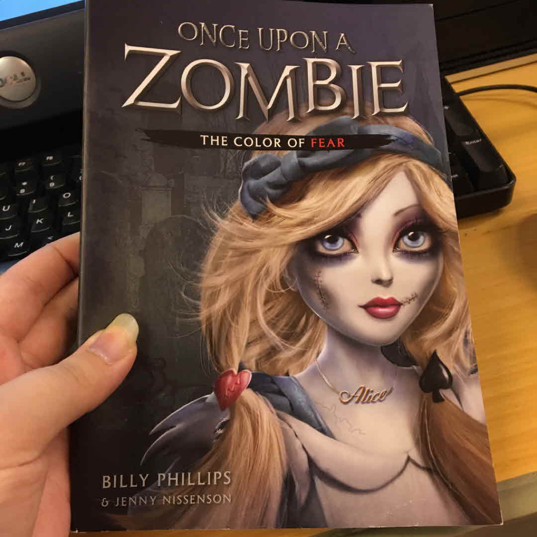
I'm a few minutes late, but here is my #uglycover for #somethingforsept. It isn't particularly ugly, but it completely misrepresents the book and isn't good from a marketing/sales perspective. It is a YA book that looks middle grade which is going to alienate a huge part of the market. Not to mention the childish merchandise they sell on their website. It's a shame too because the book doesn't sound terrible but I will never read it.